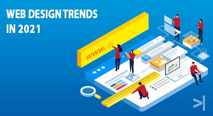
Web Design Trends in 2021
Apr 26, 2021 — Web Design & Development

A modern, relevant, and well-designed website can play a massive role in forging a good impression on your potential customers, improving your website’s search engine ranking and listing. If the last couple of years brought about minimalistic and abstract designs, infographics and gradients, it seems like 2021 has certainly stepped up a notch. Here out from best website design and development company in Pune, India.
Here are the top 5 Web Designs we believe will go trending in the year 2021:
- Parallax Scroll Animation – Parallax movement is when objects move at different speeds relative to each other, creating an optical illusion. When it comes to sites, the depth is created using foreground and background elements. With the current lockdown scenario, companies and brands have turned their focus onto their websites, meaning more uploaded content and information and a well-designed Parallax scrolling animation to emphasize or highlight important bits of content and direct viewers across your site can be a game-changer, adding more edge and depth to your website increasing your websites appeal and user-friendliness.
- Comfortable and Lighter colours – Due to the increased screen time and the eye strain because of it, Web designers have moved onto colour schemes and palettes that are less jarring and easy on the eyes. Lighter and muted colours not only induce a more calm and relaxed mood which encourages viewers to stay on the webpage longer but also make a perfect backdrop to text and illustrations which makes the overall design template clean and appealing.
- White Space – On similar lines of comfort and accessibility like the previous point, the White or Negative space seems to have made a comeback this year. White space is the space between elements, be it text or visuals on the web page. The purpose of this design is to give a well-balanced and less-cramped up feel to the web page or site, enabling its overall content to be tidy, readable, and relaxing.
- Blur and Grain – Another design to have made a comeback this year has been the use of blur and grain. Blur, especially the gaussian blur, has always been popular among web designers and in 2021 it seems like it is being used to give a soft focus to the beloved gradient designs allowing text to stand out boldly. Another use of the blur or subtle distortion and grain has been in transition effects that make the site well refined. Overall it is a brilliant design to highlight the focal points of the site.
- Bold and vintage Typefaces – Websites of big corporate companies always look to have bold and heavy fonts to make the reader instantly aware of the message. In 2020, we saw the trend of text-only images and it seems like it could follow on to this year. A simple supersized bold serif font with a light backdrop immediately catches attention. These typefaces once again follow the same clean and relaxed tone which has been a theme for the year 2021.
Web designers have moved on to calm and soothing designs as opposed to the dramatic and intense ones as sites push for more readability and accessibility. And based on these demands these are the Web design trends we believe we will come across in 2021.